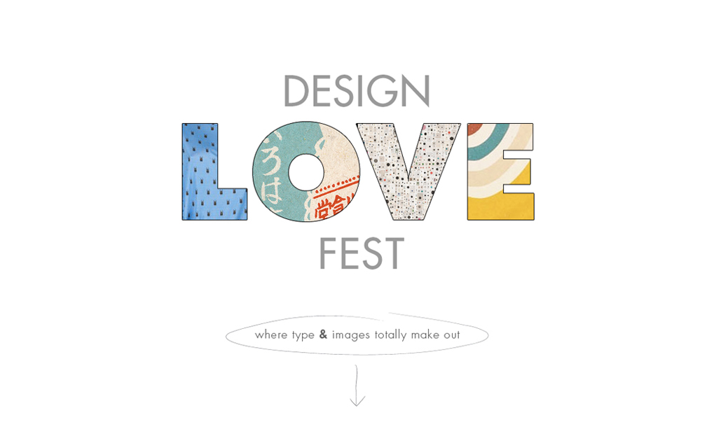
what a great sense of composition! the muted colors truly bring everything together.
in designing the FIDM magazine, I have learned so much about the importance of good content, the grid system, and the urgency for space. in a perfect world, you would have cohesive photos, tons of space for large photos and limited clutter. BUT it is very important to learn how to design layouts with just the opposite of that. because while most of us graphic designers out there would loveee to design with huge type on a page with a large single photo and a small blurb of type - we are rarely blessed with those options. Marketing peeps want MORE, MORE, MORE and we will continue to beg for LESS LESS LESS! it's all about the balance...


graphicexchange


1 comment:
beautiful blog.
Post a Comment